Let the Ink Breathe: Styling Egyptian Jewellery With Visible Tattoos
Visible tattoos and Egyptian jewellery are both designed to be noticed. Put them together without a plan and you get a shouting match: a dense forearm sleeve, a chunky scarab ring, a cuff, an ankh pendant, all competing for the same eyeballs. The fix is not to hide the ink or strip the jewellery back to nothing. It is to decide which element leads and which supports. Treat your tattoo like the print in an outfit and your jewellery like the hardware. In UK streetwear terms, that means fewer pieces, better placement and a bit of negative space.
Start With the Tattoo's Busyness, Not the Jewellery
Before you reach for the ankh, look at the tattoo. Is it dense blackwork, fine linework, colour, or a small one-off mark? Density matters more than size. A packed forearm sleeve already gives the eye plenty to read, so a simple silver ankh pendant or a single oxidised band will feel deliberate. A sparse line tattoo on the upper arm can take a scarab ring or a textured cuff without turning into a pile-up. If the ink is colourful, pick one metal tone and let that be the neutral. If the ink is black and grey, silver, steel and oxidised finishes tend to sit crisp against it, while warm brass and gold can glow nicely but need more care so the whole look does not go muddy.
Placement: Give Each Piece Its Own Postcode
The most common mistake is stacking jewellery directly on top of the most detailed tattoo. A pendant hanging over a chest piece or a cuff clamped over a forearm sleeve creates visual noise. Instead, give each element its own space. If the chest or neck is inked, let the ankh sit lower or choose a shorter chain that clears the design. If one forearm is heavily tattooed, wear the cuff on the opposite wrist or higher up where the skin is clearer. If your fingers are tattooed, a plain band often works harder than a detailed scarab ring. The aim is not to separate ink and jewellery completely, but to stop them from fighting over the same square inch.
Metal Tone Is a Contrast Decision
Do not try to match your jewellery to the colour of your ink. Black ink is not a metal tone, and colour tattoos rarely have an exact metallic match. Think contrast instead. Cool silver and gunmetal against blackwork look sharp and modern. Oxidised silver adds texture without shine, which suits detailed tattoos and older pieces. Warm gold or brass against black ink can look rich, but keep the rest of the outfit quiet so it does not tip into costume. If you are wearing multiple pieces, pick one metal family and stick to it. Two metals can work, but three starts to look accidental.
Layering Over Short Sleeves
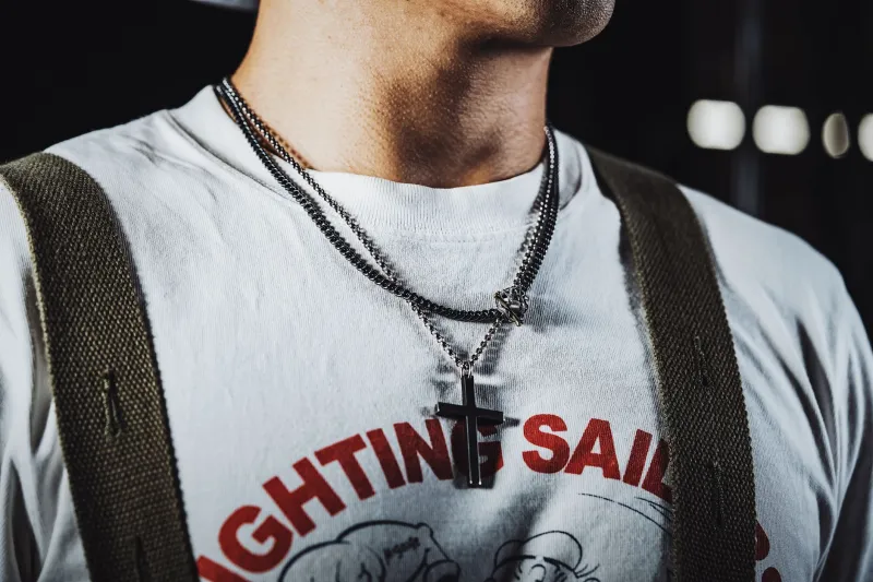
Short sleeves are where tattoos and jewellery meet most often, especially in a British summer that cannot decide what it is doing. Keep the layering simple. A crew-neck tee with an open overshirt gives you a clean line for a pendant without burying it. Let the chain sit over cotton, not under a collar. If you are wearing a cuff or bracelet, it should sit below the sleeve hem, not half-trapped under it. When you push long sleeves up, check that the cuff does not catch on the fabric or sit awkwardly against a tattooed wrist. The best short-sleeve looks leave a bit of bare skin between the ink and the metal. That gap is what makes the combination look styled rather than crowded.
The One-Conversation Rule
At any one body zone, allow one focal point. If your forearm tattoo is the main event, skip the chunky cuff on that arm. If your hand tattoos are visible, one thin ring is usually enough. If you are wearing a large ankh pendant, keep the rings simple. This is not about being boring. It is about making sure each piece gets read properly. A scarab ring looks better when it is not competing with a cuff, a watch and a bracelet on the same wrist. A single strong piece next to good ink feels confident. Three strong pieces next to good ink feels like a display cabinet.
Photographing the Combination
If you are posting the look, do not rely on flash. Flash flattens tattoo detail and turns silver jewellery into a white blob. Use window light or side light so the texture of both the ink and the metal shows. Keep the background plain: a brick wall, a neutral door, a matte jacket. Crop one detail shot of the wrist or chest, then take a full outfit shot so the styling makes sense. Turn your wrist slightly so the tattoo and the jewellery sit at different angles rather than overlapping. Do not over-edit the contrast. The point is a clean, deliberate look, not a filtered one.
A Quick UK Streetwear Checklist
- If the tattoo is busy, keep the jewellery simple and place it away from the densest area.
- Choose silver or oxidised finishes for crisp contrast against blackwork.
- Let pendants sit over a clean crew neck or between open shirt layers.
- Keep cuffs below the sleeve hem, not tangled in it.
- One focal point per body zone: ink, pendant, ring or cuff, not all at once.
- Photograph in side light with a plain background and no harsh flash.
Egyptian jewellery and tattoos can be a strong pairing because both carry meaning without needing a slogan. The trick is to let the ink breathe. Pick fewer pieces, place them with intent and give the metal and the tattoo enough space to be seen separately. That is when the combination starts to look like a considered King of Ankh outfit rather than an accident.